Our customers rely on Shibumi as their single source of truth for their most strategic programs. We’re constantly improving our platform and streamlining how programs are managed. In support of this, we’re excited to announce changes to our user interface to simplify navigation and provide a more intuitive experience for our customers.
Streamlining the user experience was a major focus in this redesign. We’ve spent the last several months working with customers, designing and re-designing, till we hit on something simple, intuitive and functional.
These changes will be rolling out over the coming months. As with most new features in Shibumi, they’re opt-in.
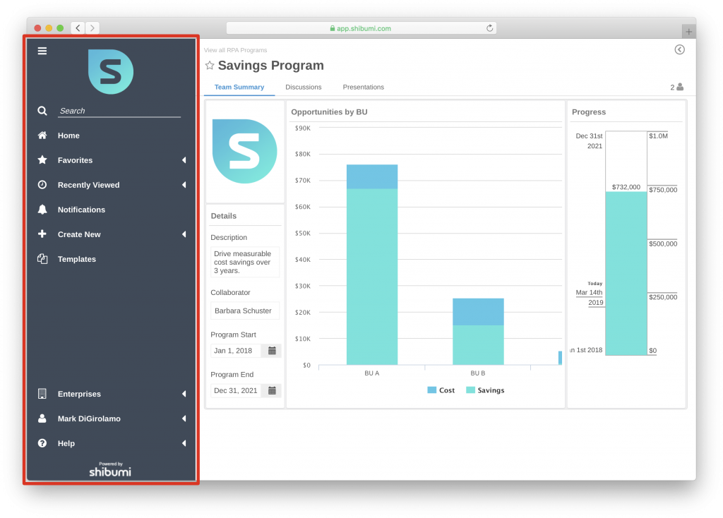
New Navigation Bar
Our redesigned navigation bar has moved from the top to the left. This makes it even easier to access your favorites, recently viewed, notifications and search.
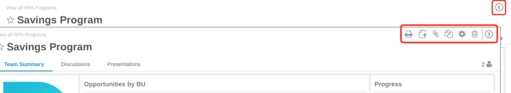
Grouped Action Controls
To simplify the Shibumi user experience, action icons (e.g., Favorite, Print, Export, etc.) that formerly appeared in the upper, right-hand corner of the page will be consolidated under a single Expand icon. Select the icon to view the available actions and then collapse the group when you no longer need them.
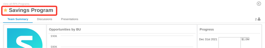
Work Item Type Icon Replaced with Favorites Star
Favoriting an item in Shibumi is the quickest way to navigate to a specific item. Once favorited it will appear in the favorites on the left nav. To make this as obvious as possible, we replaced the item type icon with the favorites star.
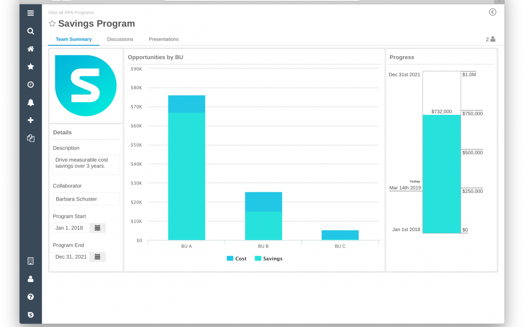
Description Removed from Header
Today, the work item Description sits directly below the title at the top of the page. With our overall goals to reduce the noise and to provide as much real estate as possible for your solution, we’re removing it.
The data you’ve entered for the Description will still be available. You can easily see the Description again by modifying your template to add the Description field to a form, list, or view section. Please reach out to your Template Admin (or to a Shibumi Solutions Consultant) to implement this change.
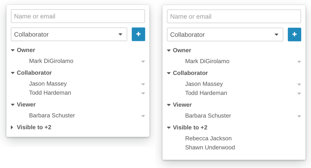
Participant Window
To further simplify the UI, we will also be improving the Participant Window. Today, there is text citing how many people have visibility to the work item and then a click opens the Participant Window to show all roles that have been directly assigned for the work item.
With the enhanced UI, the Participant Window will be accessed by clicking on a user icon. Both the assigned roles and Visible To count are now included in one window.