In our continuing journey of incorporating Google’s material design language into Shibumi, our next release introduces some exciting changes that will make managing Shibumi enterprises more intuitive and will continue to enhance your user experience.
! Read more about how Shibumi has incorporated material design here
User Settings
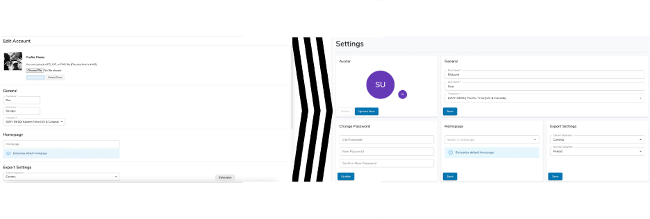
Utilizing Material Designs thoughtful approach – we have redesigned our User Settings that users can currently find under Edit my Account. The new design is clean and easy to follow – and still allows users to do all the things they need to! The new Avatar section is bright and colorful when no image is uploaded, and users can easily add or remove an image associated to their user id. Changing a password, setting a Homepage, and changing export settings have been given their own sections, making the settings page easier to understand at-a-glance.
User Management
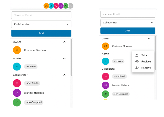
The User Management section also received a material design upgrade! With all the same features and functionality that users love, but now with an updated look and feel. Clicking on a user’s name or icon will open the dropdown menu that will allow you to manage a user’s permissions on a page. Just another way Shibumi is making it easier to for you to make changes faster.
Enterprise Settings
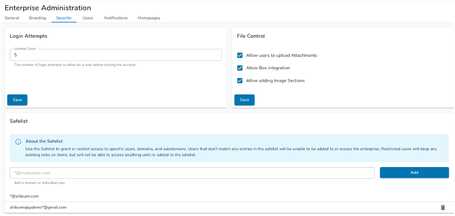
One of the biggest changes you will see in Enterprise Settings is Whitelist being renamed to be Safelist. We at Shibumi believe language matters when it comes to diversity and inclusion. With this change – you will also see we updated our GraphQL API to the same and will no longer be able to use the old term. Safelist can now be found on our Security Tab. Also included on our Security Tab is File Control which was formally found on our General Tab. Putting all things security together in one location is just one more way we are looking to streamline our Enterprise Admin’s lives!
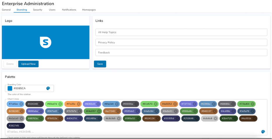
We also renamed our Custom Branding tab to just be called Branding. Enterprise Admin’s no longer must enable custom branding as they did previously – we at Shibumi know that our clients need to make the application their own! With an updated layout, the system is even easier to configure to match your organization.
Utilizing materials information block we have added information on setting up the Enterprise Homepages. This information being easily accessible will make it even easier for an Enterprise Admin to know exactly how this section will be used!

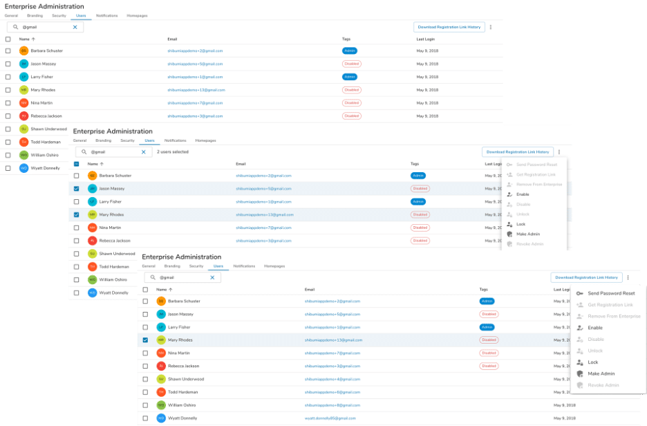
And the last tab to get a significant makeover is Users. We’ve updated the button for downloading the Registration history as well as moving the action items related to users into the menu at the top of the screen. This gives users a more intuitive feel when doing changes to a user or a group of users. The list of users is even easier to read and you can quickly find the information you are looking for such as Last Login date and time, as well as the roles associated to the user.
All these changes take Shibumi another step forward and into our exciting future! Please share your feedback on this new look and feel! And stay tuned as we continue to release additional new features over the course of 2022!
