In our journey of incorporating Google’s material design language into Shibumi, our next release introduces some exciting changes that will make managing solutions more intuitive and that will enhance the user experience.
I’d like to highlight four of the big, and not-so-big, changes you’ll see in Shibumi.
- Maintenance modes when managing templates, dashboards, and presentations
- Ability to configure sections to auto-adjust their height based on content
- Collapsed white space when removing titles from sections
- Page Level Filtering on a tab or dashboard
Managing templates, dashboards, and presentations
Material Design gives us a solid and well thought out approach to the design of our user experience. As we continue to embrace it, we’re rethinking much of how Shibumi works. In this phase we’ve modified how our templates, dashboards and presentations are created and maintained. Our long-term, loyal App Admins may need to re-train their Shibumi brains to align to the new organization of capabilities but we’re confident this new approach will be logical and intuitive for our Shi-newbie App Admins!
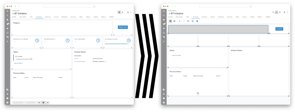
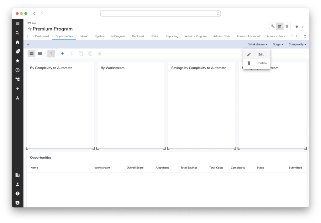
The main idea behind these changes is to create distinct modes while editing a template, dashboard, or presentation. This clear, separation of purpose helps clarify the click-path and will ultimately allow us to provide greater design and configuration control when in each mode.
Configure: This mode allows an editor to configure the data within each section. This includes adding columns, editing filters, defining section titles, etc. For those familiar with Shibumi, this mode exposes the gear icon in each section allowing you to configure that specific section.
Layout: This mode allows the editor to design the layout of the tab, dashboard, or presentation. In this mode, a format bar is displayed with options to select layout spacing as well as to add, duplicate, move, delete, or set auto-height for sections. An exciting enhancement here is that you can now multi-select to act on more than one section at a time.
Data: This mode allows the admin to manage the data attributes, data sets, roles, and business rules for the template. The data mode is only available on templates, not dashboards nor presentations. An enhancement recently released but worth mentioning again is the ability, when in Data mode, to add and edit the configuration of attributes and metrics directly on the Data tab. It provides a much more efficient method of managing the data needed for your solutions.
We are excited to provide this new purpose-driven mode approach to template management! Not only does it provide an organized and intuitive administrative experience, it will allow us to build greater functional capabilities into each distinct capability in future releases.
* A slight side effect of these changes to presentation slides was the ability to reduce the amount of padding in the slide borders. This gives more room to the content in the slide, which many have asked for. But, it does change the sizing and may impact some of our customers and partners.
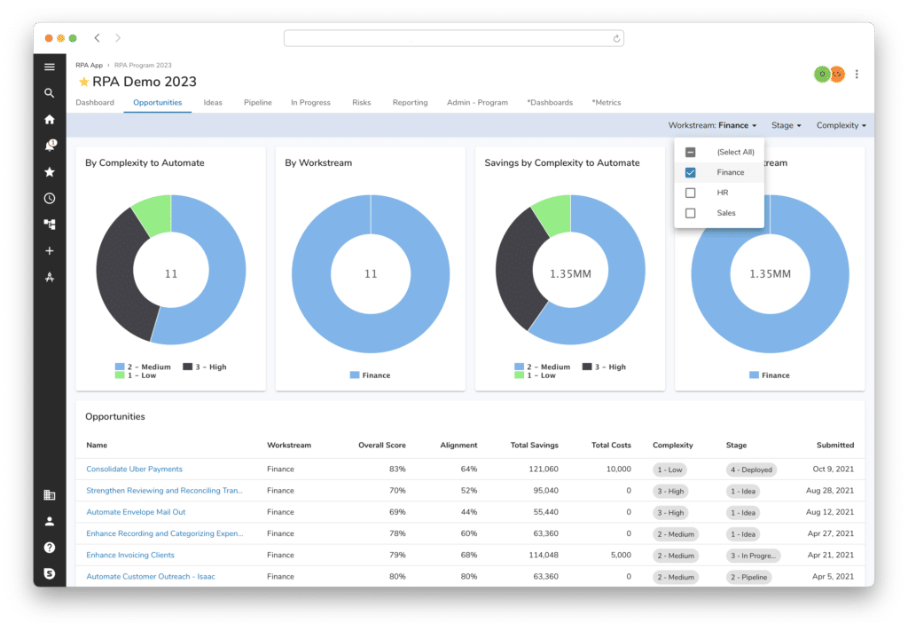
Auto height on sections
For those experienced with Shibumi, you know how configurable the platform is. On a tab, dashboard or slide you have quite a bit of control over the layout with the ability to place sections on the page and size them as needed. But, the size of a section is static – it doesn’t adjust height based on the content.
For example, consider a view of initiatives. In Shibumi it’s easy to place a view of initiatives in a layout, but what’s impossible is to predict the height of that view to ensure it’s tall enough to display all of the initiatives without scroll bars.
In practice, this resulted in scroll bars inside of scroll bars! This creates a very frustrating user interface. This example highlights the problem.
With the new Auto-Height setting, a section can grow and shrink based on the content. Those inside-the-section scroll bars won’t happen! This will have an immediate impact on usage and make interacting with the solution much easier.
Note: a by-product of this new setting is the removal of the 2-Column layout option. Previously it was the only layout that allowed section heights to expand. Now both the Standard and Condensed layouts support auto-height. As part of the release, existing 2-Column layouts will be converted to Standard layout with auto-height set for each section.
Removing titles from sections
This next enhancement could very well be the most anticipated change we’re introducing with this product release!
Previously, we provided the ability to remove section titles. That was a good step but, because it still left the bar of white space where the title would have been, it didn’t fully hit the mark. Now, when there is no title included for a section, we are collapsing the white space and giving back valuable real estate on your tabs, dashboards, and slides.
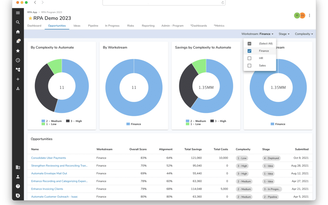
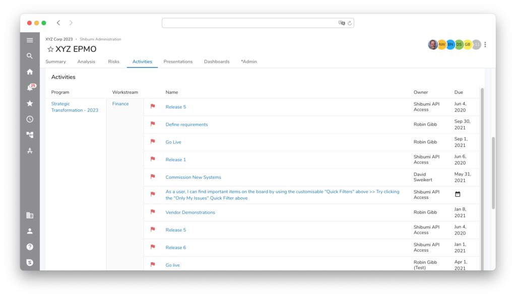
Page level filtering
Last, but definitely not least, is Page Level Filtering. We’re really excited for this one. We believe it will dramatically change how users will interact with Shibumi and make the app much more dynamic. With this enhancement, we are providing a slim row of filters at the top of a tab or dashboard. These filters will then drive the content included on the page.
So, if you have a list of initiatives and you’d like to filter on region or workstream, it is intuitive and simple to select the desired region from the filter bar. Even more exciting though is that these filters can apply to multiple sections. So, in addition to the list of initiatives any charts on the page could also react to the same filter selection.
Page Level Filtering can be configured when the tab or dashboard is in Layout mode.
This release represents an exciting step forward for Shibumi both from an App Admin and User perspective. Please share your feedback as you take advantage of the new capabilities…and stay tuned – we have even more enhancements coming soon!