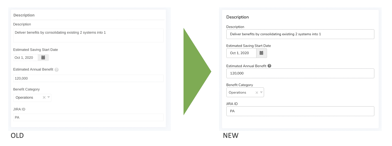
At Shibumi, we’ve always strived to combine the simplicity of consumer products with the requirements of enterprise applications. This goal drives much of the design of Shibumi and is the usability benchmark against which we measure ourselves. As Shibumi has evolved to support ever more complex and matrixed programs, keeping the solution simple and intuitive remains a primary objective.
In support of this, we’ve defined best practices when configuring a solution and tailoring it to our customers’ unique program needs. But, we wanted to take this even further.
We wanted to introduce a new, modern look-and-feel to Shibumi, as well as define user interface standards that all configured solutions will adhere to. We’ve accomplished this with our new design system!
What is a design system?
“A Design System is a set of interconnected patterns and shared practices coherently organized to aid in digital product design and development of products … “ Wikipedia
We started the process of incorporating a design system over a year ago and have spent countless hours discussing, debating, and designing. After an exhaustive review of many design systems, we standardized a variation of Google’s Material Design. Our selection of Material Design gave us a mature, well-defined base, that we have been able to easily extend to support our unique requirements.
As we applied the design system to Shibumi, consistency was a major consideration. We wanted to ensure consistency across multiple platforms (i.e., desktop, tablet and mobile) as well as consistency across elements (i.e., the controls you place onto the interface, like form fields or lists).

If a date picker behaves differently in different places, it creates frustration in our customers and in us! We not only wanted to avoid those frustrations, but also to improve the overall experience.
The introduction of the design system contributes to a more cohesive and predictable experience. The standards and consistent patterns apply not only to the core product but also to the solutions our customers are configuring to address their unique requirements. We expect this will have the added benefit of making all solutions, whether they’re out-of-the-box or highly customized, much more usable and intuitive.
So what’s changed?
Don’t worry! While the design system has improved consistency and added a modern flair to our user experience, we have not changed the general layout of a Shibumi solution. Our design system-enhanced user experience should not require any user re-training!

Here’s a quick run-down of some of the changes you’ll notice the first time you see the new user experience:
- Cosmetic changes. E.g., a new Shibumi font, different spacing for section titles, tabular section header bars that extend to the full edge of the section
- Minor functionality re-locations. E.g, the participation block. We’ve elevated this and now include the profile pictures of the people participating. This is part of trying to humanize the interface and bring more color and interest into the screens.
- Usability enhancements. E.g, improved tab scrolling. When the number of tabs in the solution exceeds the available horizontal space, left and right arrows are always available to help navigate and a tab picker allows for a quick jump to the desired tab.
In the coming months, we will be migrating our existing customers to the new user experience. This migration will be done collaboratively to ensure a seamless transition. Our new customers will get the benefit of the new design system right away!
Improving the user experience facilitates application adoption and supports our core mission of simplifying the execution of complex programs and delivering on their business benefits. We’re excited to bring you this new and improved Shibumi experience.

