

Updates to Shibumi’s Table Sections that increase SPM performance
In Shibumi’s strategic portfolio management (SPM) solutions, displaying program content in tabular sections provides a consistent, structured view of portfolio data, making it easy to analyze, compare, and quickly act on information. Shibumi understands how critical this visualization of content is to your program’s success. That’s why Shibumi continues to prioritize enhancements to tabular sections.
The visibility offered by Shibumi’s Tables is key for:
✔️ Strategic alignment
✔️ Resource optimization
✔️ Financial transparency
✔️ Cross-functional collaboration
Since the beginning of the year, we’ve amplified the power of Tables by integrating updates based on feedback from the high-performing enterprises we work with. We’re excited about each enhancement we’ve made—and also about what we have in store for future updates.
Our goal is not only to respond to the needs of our customers but to anticipate those needs so that our SPM solution supports continuous innovation.
Let’s walk through a few of the updates we’ve made so far this year.
Tree Views Kicked Off 2026
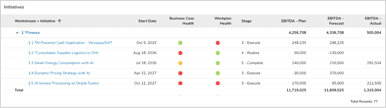
Back in January, we celebrated the new year with the introduction of the Tree View tabular section! Tree Views provide a collapsible, top-down view of parent, child, and associated items, making it easier to see the connections between high-level investments, strategic objectives, and their supporting daily tasks and resources. Executives can easily trace detailed work packages, understand dependencies and associations at a glance, and get better forecasts thanks to this flexible view.
We’ve Made the C and D in CRUD Easier
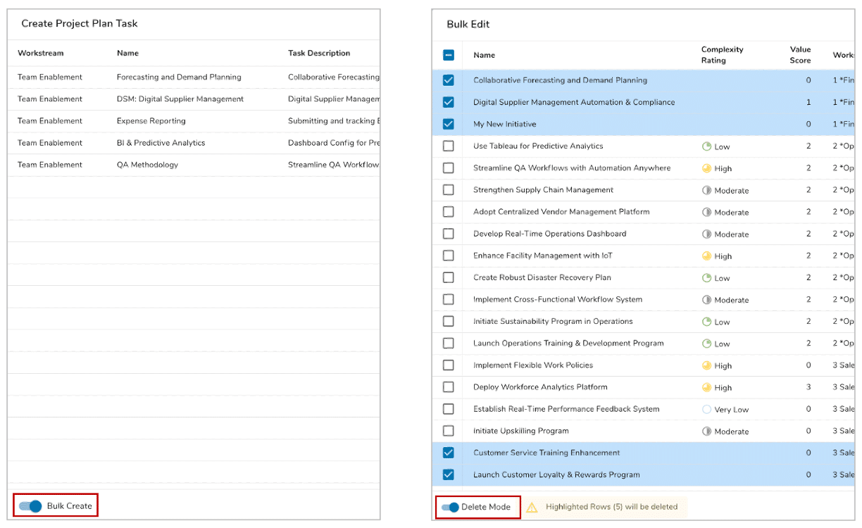
To increase Creation and Deletion agility while maintaining your program content, we’ve added bulk actions to Tables this year. Our bulk create and bulk delete functions eliminate tedium and enable teams to instantly create or delete multiple initiatives, projects, or portfolios, which translates to greater operational speed.
Another small change helps prevent costly mistakes and ensure regulatory compliance by increasing visibility during individual item deletion, with the name of item to be deleted displayed on the confirmation prompt.
Previously, the legacy List sections allowed only direct children to be created. With the introduction of the Table section, we provided the ability to create any descendant items. Initially, on the Create menu, we showed an alphabetized list of the items that could be created but quickly received feedback that this was not intuitive. Consider a program with a solution hierarchy of Program > Workstream > Initiative > Milestone. Users expected to see the Create menu options in hierarchical order but the Create menu displayed them alphabetically. One of the table CRUD improvements released this year addressed this issue by allowing App Admins to set the order of Create menu items. By providing this control, administrators can make the solution more intuitive which streamlines daily operations for users, increasing efficiency along the way.
Column Content Control
In addition to making it easier to create and delete table content, we’ve also improved how content is displayed which allows our customers to bridge the gap between high-level executive strategy and granular project execution. A few of the enhancements we’ve introduced are summarized below.
- We have simplified the inclusion of ancestor columns in tables to map complex, multi-tiered organizational hierarchies to broad strategic goals, business units, or portfolios. Previously, App Admins tediously defined calculated attributes to show this information.
- Frequently our customers define tables showing Milestones. A key piece of information to understand for each milestone is which other milestones it is dependent upon and which milestones are dependent upon it. In Shibumi, these dependent relationships are set up by establishing associations between the milestones. One of the Table enhancements introduced this year is the ability to configure reference columns that show a comma delimited list of associated items (e.g., either predecessor or successor dependencies).
- For data validation, workload scoping, and performance assessment, you can now display the Record Count included in the Table. Record Count provides immediate context on the scale of projects being managed so leaders can verify data before making decisions.
- Want to focus attention on your highest value initiatives or on the next ten milestones due to be completed? We’ve integrated a setting that limits the count of records displayed in Tables. This helps users focus on high-priority projects and ensures queries and resource management processes run smoothly.
With greater control of the content displayed in Tables, cross-functional teams can collaborate better and use specific, real-time KPIs and financial data that directly supports decision-making. These customizable columns help teams plan effectively (without creating clutter).
Enhanced User Experience
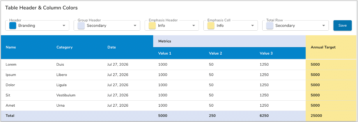
We live in an increasingly visual world. To better interpret business insights at a glance, we’ve introduced the ability to specify the header and column color formatting for Tables. This is essential for creating visually intuitive, consumable content and reducing cognitive load, so busy leaders can get business insight, assess risk, and make strategic decisions quickly and easily. Also worth noting, the way in which we’ve introduced this capability ensures a low level of effort for the App Admin. Specifically, the App Admin defines the formatting centrally and all tables in the solution inherit the definition. If a formatting change is needed, the App Admin can quickly make it in one place and have it immediately ripple out to all table sections.
Another visual improvement was introduced specifically to the Metric Table. In other tables, App Admins could define the row height to allow for cell content to wrap. Although Metric Tables often only contain numbers in timeframes, they can also be configured to show context information for those numbers. If too long, this contextual information was truncated in the static height Metric Table. The enhancement we introduced addresses that challenge by allowing the App Admin to set the metric table row height just like they are able to in the Standard and Tree View tables.
Lastly, when content in a cell or header is truncated, an instinctual user reaction, based on years of experience with spreadsheet solutions, is to drag the cell border to make the cell wider. Shibumi introduced user-adjusted column widths to address this instinct. You’ll never have to abandon nuanced naming conventions to fit into a cramped cell again.
But Wait, There’s More… Coming Soon!
As we head into 2H 2026, we’re keeping the tabular section momentum going with the introduction of Visualization columns. These will allow you to define progress bars and timeframe charts within your table cells to share trend and progress information at-a-glance.
Do More With Your SPM, Powered by Shibumi’s Tables
Real-time prioritization. Agile resource allocation. Data driven decision making. It’s all underpinned by the tables in your SPM solution. With Shibumi, you can transform portfolio management from a rigid quarterly task to an “always on” process that drives competitive advantage. And you can do it all by customizing your Tables in Shibumi.
Want to know more about how Tables can connect to and further your corporate strategy? Get in touch with questions or for a free demo.