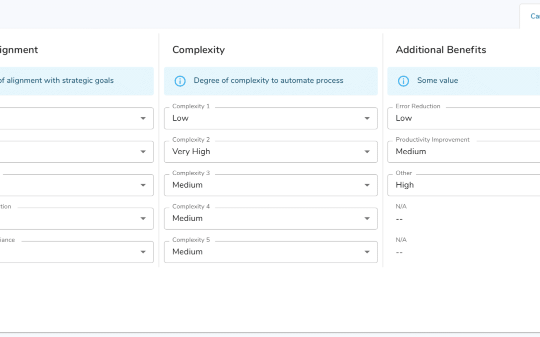
Today we’re excited to announce our next step in incorporating Google’s material design system into Shibumi. Our upcoming release includes a new forms experience with some highly requested capabilities.
Shibumi forms are the primary way our users collect and maintain their critical, strategic data. For example, on forms, users can add and update KPI targets, manage the details of a transformation program, or enter a status update on a single milestone. Forms make this detail easy to capture and review.
We’ve spent months iterating the experience and streamlining it to make it simple for an app administrator to configure and for users to interact with our forms. We’d like to highlight three enhancements you’ll see with this new release.
- A Save button!
- Adding help messages directly to forms
- Organizing form layouts
A Save button!
Let’s start with the biggest enhancement you’ll see in our new forms capability, a Save button!
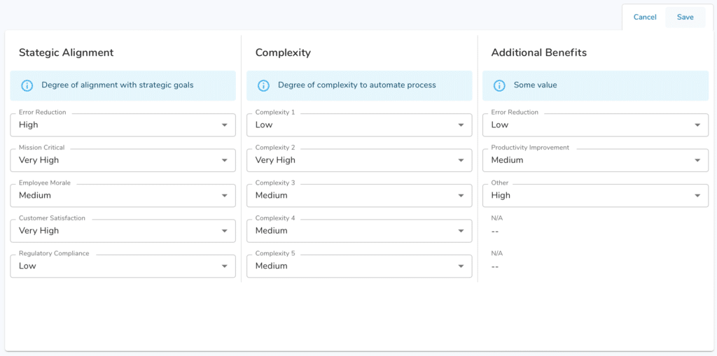
All forms in Shibumi now have a Save button enabling you to purposefully Save your changes. Shibumi will no longer immediately and automatically save values as they are entered into form fields. We’ve spent countless hours on this specific feature, weighing feedback we’ve received from hundreds of users. Ultimately, while instant saving was occasionally a time saver, it left many users unsure if their information was actually retained. In fact, we learned that users were reloading the page just to make sure their edits had been saved. An explicit Save button removes the uncertainty and is an intuitive adjustment that completely addresses this issue.
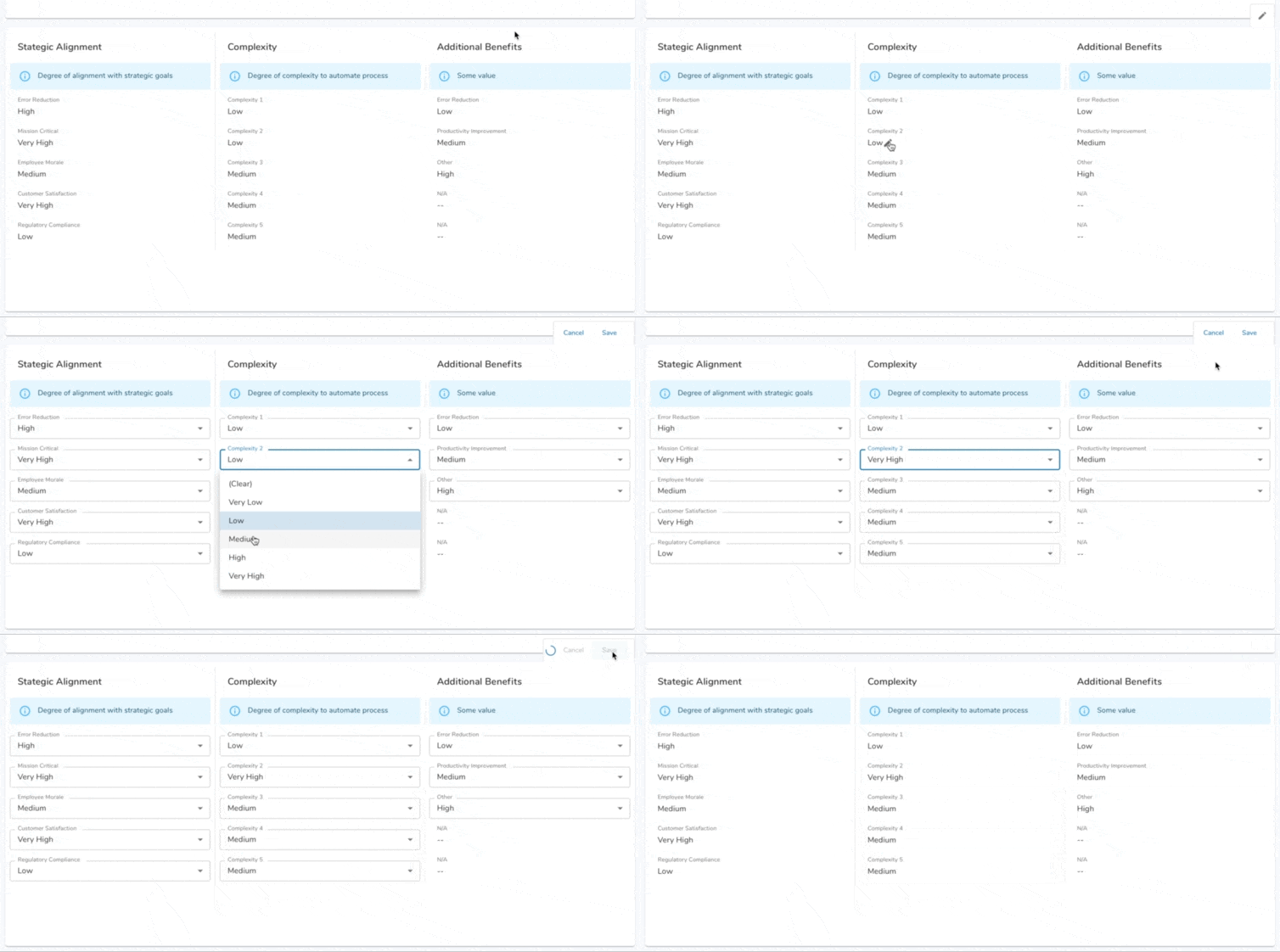
With the addition of the Save button, the form now has two states: a View state and an Edit state. As soon as you click on a field, the full form flips to Edit. You can also switch to Edit by clicking the Edit icon displayed at the top right of the form. Save (or Cancel, which aborts all edits) will switch the form back to View state.
Adding help messages directly to forms
Another exciting thing you may have noticed in the screenshot above is the (i) info help messages that can now be placed on the form. This was a common usability request we’ve heard through the years. Often the details being captured on a form require extra explanation and instruction. Previously, app admins creatively added read-only attributes or rich text sections to provide this information. These work-arounds are no longer necessary! With the ability to place help messaging directly in the form, it is much easier for users to understand what information is being requested and ultimately for your Shibumi solution to capture the correct detail.
Organizing form layouts
This is a huge one. Shibumi has always made it easy to tailor the user interface so that app admins had great control over how their Shibumi solutions looked but our forms specifically did not offer a deep level of flexibility. Until now.
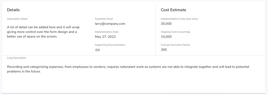
Our app admins now have complete control over form layout and how the fields are positioned in the form. Three columns of fields, no problem! Four columns, sure! Six columns, go crazy! Within each form section, you can have up to twelve columns of data (though twelve columns in a small form section isn’t a best practice we’d recommend). The ability to more granularly organize the fields within a form was a common request to make better use of the space on the screen. In addition to providing more flexibility positioning fields, we have also introduced horizontal and vertical lines to better organize and create distinct areas within the form and we have introduced labels to annotate the sections of the form.
Enabling an app admin to manage all of this new capability was also a major concern and we have worked to make that experience as intuitive as possible.
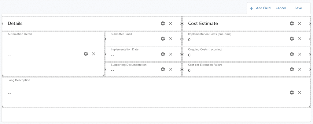
One note: as a by product of introducing the greater granularity of field layout within the form, we’ve removed the field label placement options. Field labels will consistently be displayed above each field.
Our new forms went live in release 173. But, this wasn’t the only thing included in that release. Read our release notes to learn about all the new capabilities.
We’re always looking for feedback and welcome your experience using our new forms. And stay tuned as we continue to release additional new features over the course of 2022!

