
Overview
In Shibumi, Pick List attributes provide the ability to limit the values that can be entered into a field. App Admins configure the pick list attributes on templates. There are several types of pick lists available:
- Single Select
- Multi Select
- Name/Text Value
- Name/Numeric Value
- Icon/Name/Text Value
- Icon/Name/Numeric Value
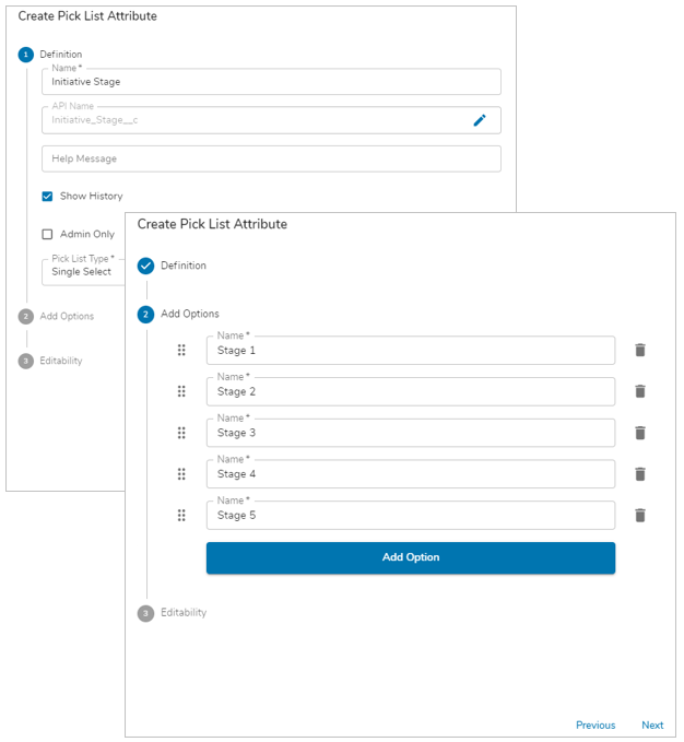
Single Select
Single Select pick lists allow the user to select only one option from the pick list. The displayed value and stored value match for this type of pick list. One example use case for a Single Select pick list is the Initiative Stage (i.e., the initiative can only be in one stage at a time).
To add a Single Select pick list:
- On a template Data Panel, click Create Attribute and select Pick List.
- Enter a Name for the pick list attribute (Shibumi will automatically define the API Name using the Name you’ve entered).
- (Optional) Define whether to show History for the association and if it is visible only to Admins via the checkboxes.
- Leave the default “Single Select” value in the Type field.
- Click Next.
- Enter Options to be displayed for the pick list. Click the Add Option button or hit enter to add more options.
- Click Next.
- (Optional) Set an editability rule for the Pick List.
- Click Create.
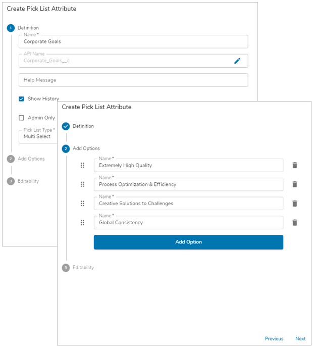
Multi Select
Multi Select pick lists allow the user to select multiple options from the pick list. The displayed values and stored values match for this type of pick list. One example use case for a Multi Select pick list is the list of Corporate Goals supported by an initiative (e.g., the initiative might support both the Extremely High Quality and the Global Consistency goals).
To add a Multi Select pick list:
- On a template Data Panel, click Create Attribute and select Pick List.
- Enter a Name for the pick list attribute (Shibumi will automatically define the API Name using the Name you’ve entered).
- (Optional) Define whether to show History for the association and if it is visible only to Admins via the checkboxes.
- Select “Multi Select” from the Type dropdown.
- Click Next.
- Enter Options to be displayed for the pick list. Click the Add Option button or hit enter to add more options.
- Click Next.
- (Optional) Set an editability rule for the Pick List.
- Click Create.
Name Value
Name Value pick lists allow the user to select only one option. Each named option in the pick list is paired with a corresponding value. This value can be either a text value or a numeric value. Shibumi displays the named option in the pick list but stores both the name and the value options.
One example use case for a Name Value pick list is a Complexity Assessment that factors into an RPA Opportunity prioritization. Typically, this Complexity Assessment pick list would be one of several contributing to an overall prioritization score. E.g., selecting “High” in the Complexity Assessment pick list provides a numeric value of “10” to the prioritization score calculation.
- On a template Data Panel, click Create Attribute and select Pick List.
- Enter a Name for the pick list attribute (Shibumi will automatically define the API Name using the Name you’ve entered).
- (Optional) Define whether to show History for the association and if it is visible only to Admins via the checkboxes.
- Select “Name / Numeric Value” or “Name / Text Value” from the Type dropdown, depending on which type of value you need.
- Click Next.
- Enter Options to be displayed for the pick list as well as the option’s corresponding value. Click the Add Option button or hit enter to add more options.
- Click Next.
- (Optional) Set an editability rule for the Pick List.
- Click Create.
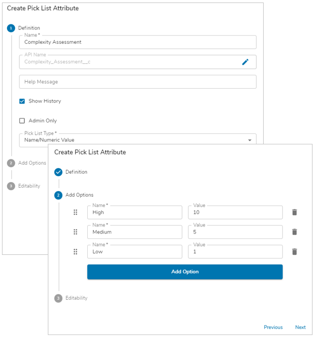
Note: To reference the value of the pick list option in an expression, add the .value expression suffix to the attribute API name. For more information see the expressions Attributes article.
Icon Name Value
Icon Name Value pick lists allow the user to select only one option. Each named option in the pick list has a corresponding value (which can be either text or numeric) as well as a corresponding icon (the configuration of which includes a color selection). Shibumi displays the named option and the icon and additionally stores the value option for use in expressions and calculations.
One example use case for the Name Value Icon pick list is as the Initiative Status indicator. E.g., selecting “Progressing As Expected” displays a green circle icon and stores a numeric value of “3”. Selecting “Issues Identified” displays a yellow circle icon and stores a numeric value of “2”. Selecting “Immediate Attention Required” displays a red circle icon and stores a numeric value of “1”. The numeric values of all of the initiatives are then averaged to determine the overall status of the program.
To add an Icon Name Value pick list:
- On a template Data Panel, click Create Attribute and select Pick List.
- Enter a Name for the pick list attribute (Shibumi will automatically define the API Name using the Name you’ve entered).
- (Optional) Define whether to show History for the association and if it is visible only to Admins via the checkboxes.
- Select “Icon / Name / Numeric Value” or “Icon / Name / Text Value” from the Type dropdown, depending on which type of value you need.
- Click Next.
- Enter Options to be displayed for the pick list. For each Option:
- Enter a name in the Name field.
- Enter a value to be stored in the Value field.
- Select the desired icon from the Icon dropdown.
- Select the icon color from the color picker dropdown or enter a HEX color code. (Note: The hex codes for the red, yellow, green colors used for Shibumi’s metric icons are: Green #2e7d32, Yellow #ed6c02, Red #d32f2f)
- Click Next.
- (Optional) Set an editability rule for the Pick List.
- Click Create.
Note: To reference the value of the pick list option in an expression, add the .value expression suffix to the attribute API name. For more information see the expressions Attributes article
Editing Pick Lists on the Data Panel
To modify configuration of existing pick lists, click on the edit icon in the Actions column to open the attribute details dialog. Click on the Options dialog tab to modify the pick list options. Change the display order of pick list options by using the grabber icon to drag options. Edit options in-line.
To remove existing options, click the trash can icon to delete it.
- If the deleted pick list option was previously selected on a work item instance, the selection will NOT be removed on template Publish but the pick list field will no longer display the removed option for selection.
- It is important to understand behavior when the icon or value are replaced. E.g., if you delete the High, 10, green circle option and then add a High, 20, blue circle option, after publish, all existing instances that previously displayed the High green circle icon will now display the High blue circle icon BUT the attribute will still be storing 10 as the value and will not automatically be updated to 20. This is intentionally designed to provide UI consistency but to preserve data integrity (e.g., prioritization scores of closed work items).