
Overview
The Board section is an extremely performant, interactive view of work items that provides easy management and visualization of your work. The Board section includes columns representing the values on a Pick List. The cards stacked in each column represent the work items with the matching Pick List value. Drag and drop cards into different columns to re-assign the pick list value. Click on a card to open the work item’s Preview Pane, if enabled.
Adding a Board
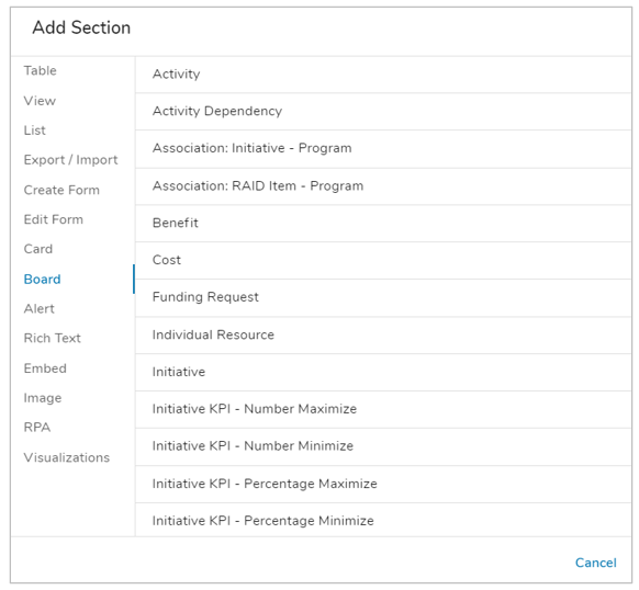
- On a layout in Design mode, open the Add Section dialog.
- Select the Board option from the left panel.
- Click on the desired Template type or Association to define what type of work items will display in the section. The new Board section will appear on the layout.
Customizing a Board
General
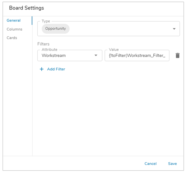 Click on the gear icon at the top right of a Board section and choose Settings. The Settings dialog will open to the General tab.
- From here, you can change the Type via the drop-down menu to see all available templates for implementation. Select one or more templates or associations to define the type.
- (Optional) Add one or more Filters to the Board section. Select an attribute to filter by from the Attribute dropdown and enter a value in the Value text box. A Page filter can be referenced in the value field using the {!toFilter(Filter_API_name__f) expression.
Columns
Columns represent the values of a Pick List field. Drag and drop cards between columns to change the item’s pick list value.
- Next, navigate to the Columns tab.
- Open the pick list dropdown to choose from available Pick List attributes based on the defined Type in the General tab. Once selected, the values from the Pick List will generate below, including an (Empty) columns that will display work items that do not have a Pick List value assigned.
- (Optional) Use the checkboxes under Display to define whether the value will be visible as a column or not. Edit the Label for the column, if desired.
- (Optional) Drag the values to reorder the column display.
- Select an attribute to Sort By and Sort Direction via the drop-down menus. By default, the columns will be sort ascending by Name.
Note: When displaying multiple types in a Board, the selected templates must have the same Pick List configured (matching API Names and options) or the section will not display content.
Cards
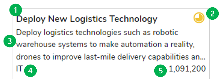
Cards stack in each column of the Board section, representing work items with the matching Pick List value.
- Finally, navigate to the Cards tab.
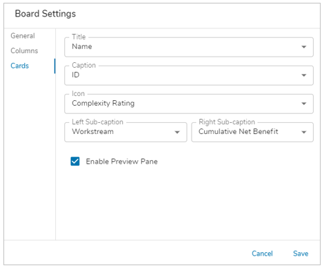 These 5 fields can be included on cards, selecting from an attribute or role to pull data from. All fields are optional other than Title:
- Title: the main focus of a card. Defaults to Name.
- Icon: displays an icon in the top right of the card. Choose from any icon/name/value pick lists configured on the template type displayed in the Board.
- Caption: text will wrap up to 3 lines then truncate.
- Left Sub-caption
- Right Sub-caption
- (Optional) Choose to disable the Preview Pane that appears when clicking on a card. It’s enabled by default.
- Save. Publish changes if on a template.
Notes:
- Board sections can only be set to Fixed Height or Fit to Window.
- Board sections drag-and-drop functionality cannot be used on Mobile.