
Tabs
Tabs allow for organization of the information into focused, streamlines views. Use tabs to break up the information and reduce information overload.
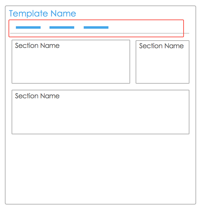 |
Tabs can be hidden & shown based on visibility rules. Try to keep the total # of tabs ever visible at one time to 5. Use visibility rules to limit tabs based on initiative lifecycle, role, etc…
If similar information is being displayed at multiple levels within a hierarchy, use tabs with the same name to organize it. This promotes consistency and usability. |
There are three layout types for tabs
- Two Column Layout – splits the page into two columns. You can either choose full width or half-width for your sections. Sections automatically grow depending on content.
- Standard Layout – Provides more granular control over height and width of sections. Sections will respect height and width, regardless of amount of content. Includes padding around each section, giving the layout a modern look.
- Condensed Layout – Provides the same controls as Standard Layout with thinner boundaries between sections. Allows you to fit the most content onto a tab.
* Always test the template using multiple screen widths to be sure it’ll display correctly on desktops, tablets & smartphones and in multiple browsers and OSs.
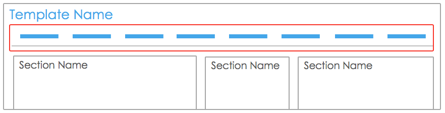 |
Too many tabs? Consider visibility rules to reduce the number of tabs visible to a standard user. E.g. do users really need to see History? |