Overview
There are various section types and each has a different purpose. Typically a tab is made up of a collection of sections. As a general rule limit the number of sections within a tab to 5. If more than 5 are necessary, keep in mind of performance and limit the amount of information being displayed in each.
 |
When adding view and list columns be conscious of colors and layout, especially how it relates to the enterprise custom branding.
Always turn off the additional controls that are not necessary (multi-select checkbox, preview pane, Gantt, list, chart) Whenever possible lock down filters to restrict unnecessary options & ensure consistency. * Always test the template using multiple screen widths to be sure it’ll display correctly on desktops, tablets & smartphones. |
Lists & Views
Lists & Views allows users to navigate & manage data.
 |
Lists: Allow users to create new items and select which items to appear in the section.
Views: Dynamically pull in items based on filter settings. |
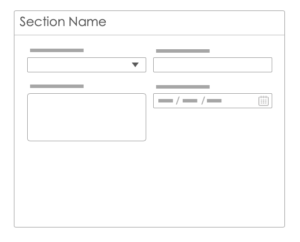
Forms
Forms allow data to be entered into fields using a form style interface.
 |
* Always test the template using multiple screen widths to be sure it’ll display correctly on desktops, tablets & smartphones. |
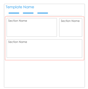
Sections
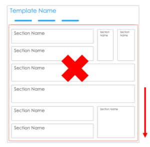 |
Limit each tab to 5 sections
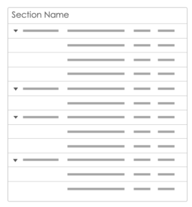
Avoid excessive scrolling
|
Designing Columns
| When fixing column widths if you set the width on the last column it may not look great with different resolutions leading to white space: |
 |
| Therefore don’t set a column width in the right most column, and instead leave it blank so the column expands |
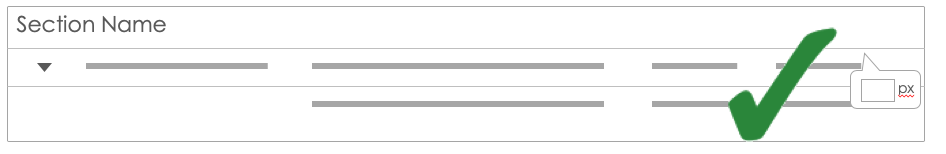 |
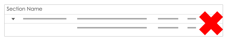
Align Columns
Align columns in similar lists and views
 |
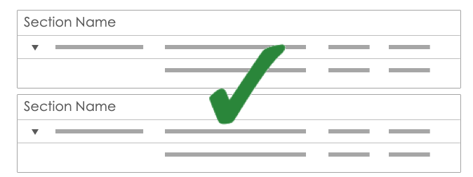 |
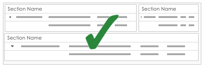
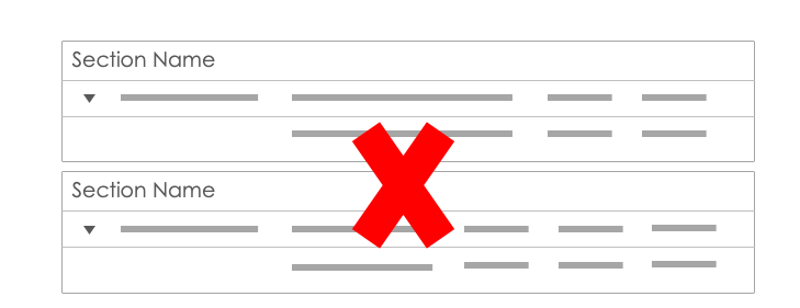
Align Sections
Align sections as much as possible
 |
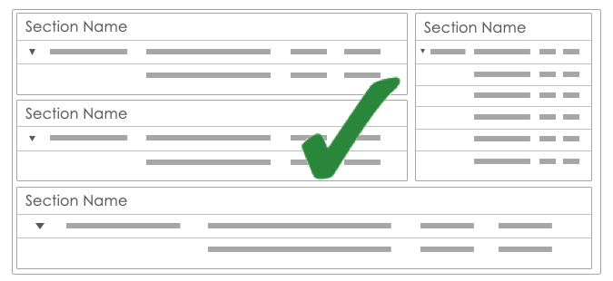 |
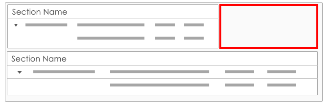
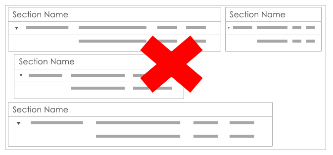
Avoid Grey Space
| Avoid grey space in a layout
|
| Layout sections to avoid empty space
|